 ExpressAgain
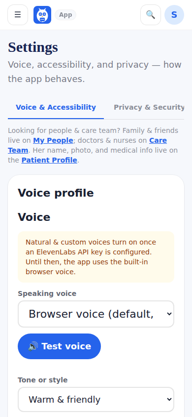
Choose larger text, bigger touch targets, higher contrast and reduced motion in Settings under Voice and Accessibility (the guided setup asks the same things in its second step). The whole app reflows to match; nothing gets cut off. A simple-language preference keeps wording short and plain. These are not buried options — they are the point: the app is designed for one-handed use, tired eyes and hard days.
What it looks like
Screens at phone width, with sample names — no real person’s information.
Was this helpful, or is something out of date? Write to support@expressagain.com and a real person will fix it.